CSS Gradients: A Practical Guide with Copy-Paste Examples
By Byteary Team · Sep 18, 2026 · 3 min read
Gradients are one of the cheapest ways to make a page look finished. No image to download, no extra request, and they scale perfectly on any screen. The syntax looks fiddly at first, but you only need a few patterns.
The basics: linear-gradient
A gradient is an image generated by the browser, so it goes anywhere an image can - usually background or background-image:
.hero {
  background: linear-gradient(90deg, #7c3aed, #2563eb);
}
This fades from purple on the left to blue on the right. The angle sets the direction: 0deg points up, 90deg to the right, 180deg down. You can also use words like to right or to bottom right.
Colour stops
Add as many colours as you like, and optionally say where each one sits:
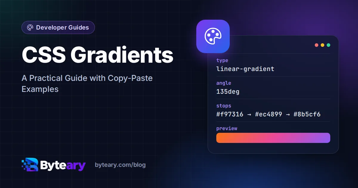
background: linear-gradient(135deg, #f97316 0%, #ec4899 50%, #8b5cf6 100%);Without positions, colours are spread evenly. With them, you control where each transition happens.
Build one visually
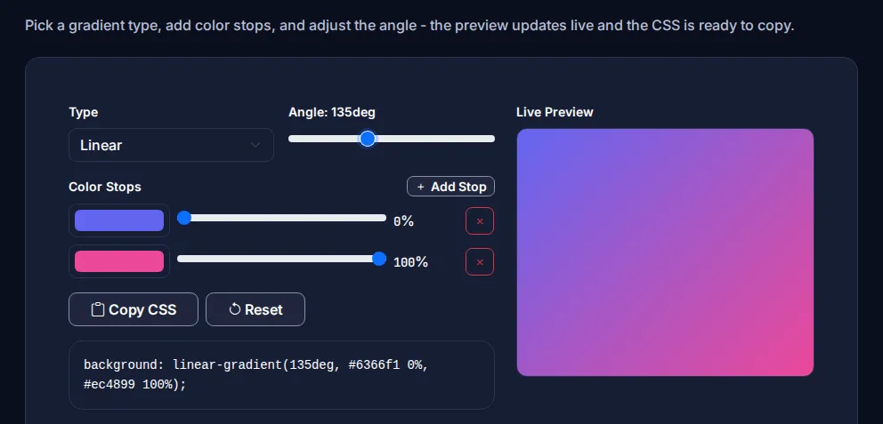
- Open the CSS Gradient Generator.
- Choose Linear or Radial.
- Drag the angle slider, pick colours, and use Add Stop for extra colours; each stop has its own position slider.
- Watch the Live Preview, then click Copy CSS.
Radial gradients
background: radial-gradient(circle at top left, #22d3ee, #0f172a 70%);Radial gradients spread out from a point. They are great for soft "glow" effects behind a hero heading or a product image. circle keeps it round; the default ellipse stretches to fit the box.
Hard stops: stripes and split backgrounds
If two stops share the same position, there is no fade - you get a sharp edge:
/* Half and half */
background: linear-gradient(90deg, #111827 50%, #f9fafb 50%);

/* Diagonal stripes */
background: repeating-linear-gradient(45deg, #fde68a 0 10px, #fbbf24 10px 20px);
Gradient text
.title {
  background: linear-gradient(90deg, #7c3aed, #2563eb);
  -webkit-background-clip: text;
  background-clip: text;
  color: transparent;
}
Use it for a word or a short heading, not paragraphs. And always check it still reads well if the gradient fails to load.
Keep text readable
A gradient that looks great on its own can make white text hard to read at the light end. Two fixes:
- Keep both ends of the gradient dark enough (or light enough) for your text colour.
- Add a semi-transparent overlay: stack a second gradient such as
linear-gradient(rgba(0,0,0,.35), rgba(0,0,0,.35))on top.
WCAG asks for a contrast ratio of at least 4.5:1 for normal text. Test the lightest part of the gradient against your text colour - WebAIM has a free contrast checker.
Performance note
CSS gradients cost almost nothing to load, which makes them a good replacement for decorative background images. If you do use images, see our comparison of WebP, JPG and PNG to keep them small.
More CSS generators
- Box Shadow Generator
- Glassmorphism Generator - frosted-glass cards, which look best over a gradient
- Colour Palette Generator
- CSS Button Generator
For the full syntax, including conic-gradient() for pie-chart and colour-wheel effects, see MDN's gradient reference.